 盘古低代码
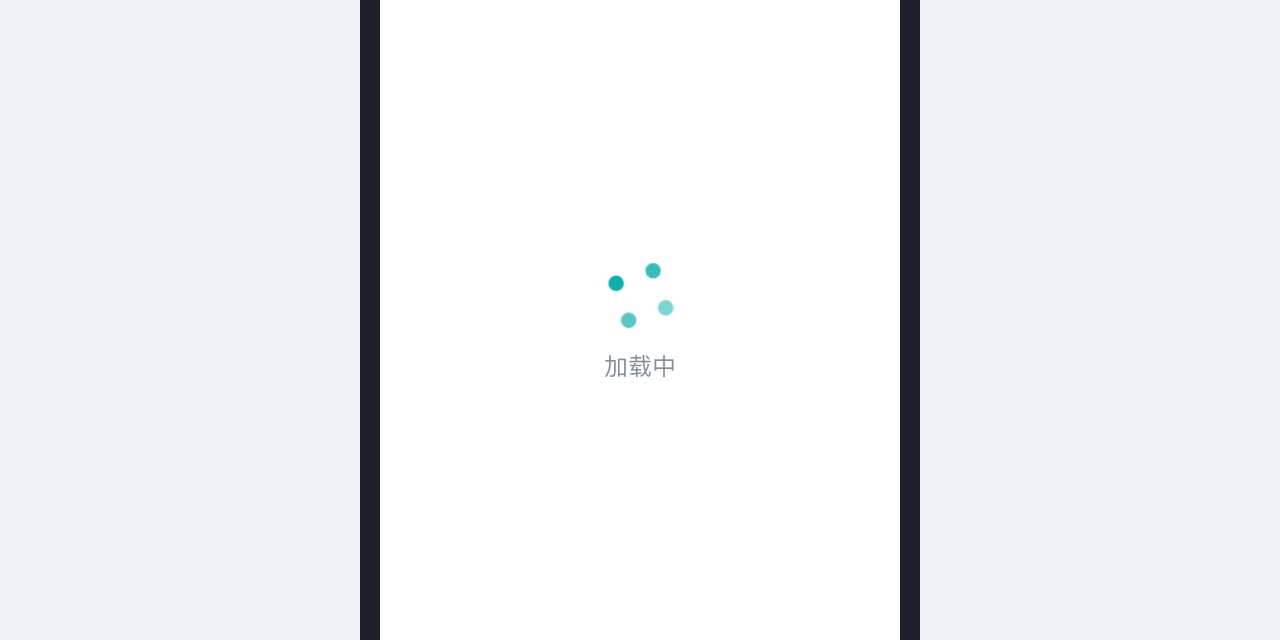
盘古低代码加载中 Spin
当用户触发页面中某个交互动作,加载数据时出现,用于填补用户等待时间,从而降低用户因等待而产生的焦虑情绪。
使用场景
进入一个新页面或加载一个容器时,一次性加载完所有的内容后展示给用户。等待感显得比较强烈,超过3秒则容易使用户产生焦虑的情绪。
设计要求
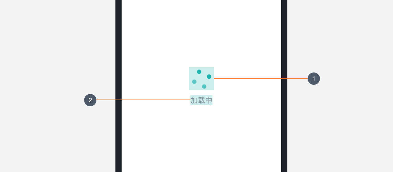
- 图形:主体图形,推荐使用循环动画
- 文案:数据加载时的反馈,最多可支持扩展至10个字已满足体验需求,注意文案不需要使用“…”
- 位置:页面的Spin需要出现在页面当前可见区域的中央,容器的Spin需要出现在容器区域的中央
注意事项
- 同一个界面中,要确保加载的唯一性,不可同时使用两个,以避免造成困惑
- 通常情况下不建议单独使用文字进行Spin的展示
示例动画
在没有特殊需求的情况下,我们提供了一段 CSS 格式的图形动画代码示例,前端开发人员可以使用在自己的项目中。
HTML
<!DOCTYPE html>
<html lang="zh-cmn-Hans">
  <head>
    <meta charset="utf-8" />
    <meta http-equiv="X-UA-Compatible" content="IE=edge" />
    <meta name="viewport" content="width=device-width,initial-scale=1.0" />
    <title>加载中 Spin</title>
    <style>
      #loading-mask {
        position: fixed;
        left: 0;
        top: 0;
        height: 100%;
        width: 100%;
        background: #fff;
        user-select: none;
        z-index: 9999;
        overflow: hidden;
      }
      .loading-wrapper {
        position: absolute;
        top: 50%;
        left: 50%;
        transform: translate(-50%, -100%);
      }
      .loading-dot {
        animation: antRotate 1.2s infinite linear;
        transform: rotate(45deg);
        position: relative;
        display: inline-block;
        font-size: 64px;
        width: 64px;
        height: 64px;
        box-sizing: border-box;
      }
      .loading-dot i {
        width: 22px;
        height: 22px;
        position: absolute;
        display: block;
        background-color: #00AAA6;
        border-radius: 100%;
        transform: scale(0.75);
        transform-origin: 50% 50%;
        opacity: 0.3;
        animation: antSpinMove 1s infinite linear alternate;
      }
      .loading-dot i:nth-child(1) {
        top: 0;
        left: 0;
      }
      .loading-dot i:nth-child(2) {
        top: 0;
        right: 0;
        -webkit-animation-delay: 0.4s;
        animation-delay: 0.4s;
      }
      .loading-dot i:nth-child(3) {
        right: 0;
        bottom: 0;
        -webkit-animation-delay: 0.8s;
        animation-delay: 0.8s;
      }
      .loading-dot i:nth-child(4) {
        bottom: 0;
        left: 0;
        -webkit-animation-delay: 1.2s;
        animation-delay: 1.2s;
      }
      @keyframes antRotate {
        to {
          -webkit-transform: rotate(405deg);
          transform: rotate(405deg);
        }
      }
      @-webkit-keyframes antRotate {
        to {
          -webkit-transform: rotate(405deg);
          transform: rotate(405deg);
        }
      }
      @keyframes antSpinMove {
        to {
          opacity: 1;
        }
      }
      @-webkit-keyframes antSpinMove {
        to {
          opacity: 1;
        }
      }
      /* 进度条颜色 */
      #nprogress .bar {
        background: #00aaa6 !important;
      }
      #nprogress .peg {
        box-shadow: 0 0 10px #00aaa6, 0 0 5px #00aaa6 !important;
      }
    </style>
  </head>
  <body>
    <div id="app">
      <div id="loading-mask">
        <div class="loading-wrapper">
          <span class="loading-dot loading-dot-spin"><i></i><i></i><i></i><i></i></span>
        </div>
      </div>
    </div>
  </body>
</html>