 盘古低代码
盘古低代码树选择
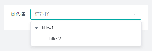
介绍
可以对树形结构数据进行选择。
API
Props
| 参数名 | 描述 | 类型 | 默认值 |
|---|---|---|---|
| status | 状态 | 'default' |'disabled'| 'hide'|'readonly' | 'default' |
| title | 标题 | string | '树选择' |
| showLabel | 显示标题 | boolean | true |
| value | 默认值 | string | - |
| placeholder | 占位提示 | string | '请选择' |
| width | 字段占比 | '25%'|'50%'|'75%'|'100%' | '100%' |
| labelWidth | 标签宽度 | string | - |
| name | 数据字段 | string | - |
| allowClear | 清除按钮 | boolean | false |
| isVirtualList | 开启虚拟列表 | boolean | false |
| VirtualListHeight | 可视区域高度 | number | 200 |
| options | 选项数据 | array | - |
| fieldNames | 指定字段名 | {key:string,title:string,children:string} | {key:'key',title:'title',children:'children'} |
| allowSearch | 可搜索 | boolean | false |
| filterOption | 是否过滤选项 | boolean | false |
| filterTreeNode | 过滤函数 | Function | 'function action(ctx, params) {\n const {\n searchValue,\n nodeData\n } = params;\n return nodeData.title.toLowerCase().indexOf(searchValue.toLowerCase()) > -1;\n}' |
| searchDelay | 搜索事件延迟时间,可搜索生效时可配置 | string | '500' |
| loading | 是否为加载状态 | boolean | false |
| multiple | 多选 | boolean | false |
| maxTagCount | 最多显示标签数量 | number | - |
| isLoadMore | 开启异步加载 | boolean | false |
| loadMore | 异步加载函数 | Function | 'function action(ctx, params) {\n return true;\n}' |
| baseStyle | 自定义样式 | string | - |
| customClass | 类名绑定 , 绑定类的名称 | string | - |
| boxStyle | 盒模型 , margin,border,padding设置 | BoxStyle | - |
| uniqueKey | 唯一标识 , 组件的唯一标识 | string | - |
| extra | 补充说明 | string | - |
| tip | 气泡提醒 | string | - |
| validate | 校验 | Validate | - |
| loop | 循环, 循环渲染设置 | Loop | - |
Events
| 事件名 | 描述 | 参数 |
|---|---|---|
| onChange | 值发生改变时 | ctx params: {value:{[key: string]: string}[]} loop:LoopParams |
| onSearch | 用户搜索时 | ctx params:{value:string} loop:LoopParams |
| onClear | 点击清除按钮时 | ctx params:Params |
| onPopupVisibleChange | 下拉框显示状态改变时 | ctx params: {visible: boolean,value:{[key: string]: string}[]} loop:LoopParams |
Type
javascript
// 点击清除按钮时参数类型
type Params = {
  indexName:string,
  paramName:string,
  ref:ComputedRefImpl,
  row:number,
  rowIndex:number
}[]