 盘古低代码
盘古低代码下拉单选
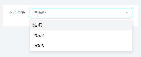
介绍
当用户需要从一组数据中选择一个,可以使用下拉单选组件,点击后选择对应项。
API
Props
| 参数名 | 描述 | 类型 | 默认值 |
|---|---|---|---|
| status | 状态 | 'default' |'disabled'|'hide'|'readonly' | 'default' |
| title | 标题 | string | - |
| showLabel | 显示标题 | boolean | - |
| value | 默认值 | string | - |
| placeholder | 占位提示 | string | '请选择' |
| width | 字段占比 | '25%'|'50%'|'75%'|'100%' | '100%' |
| labelWidth | 标签宽度 | string | - |
| name | 数据字段 | string | - |
| allowSearch | 可搜索 | boolean | false |
| searchDelay | 搜索事件延迟时间,可搜索生效时可配置 | string | '500' |
| filterOption | 是否过滤选项 | boolean | true |
| optionFitWidth | 下拉框宽度自适应 | boolean | false |
| allowClear | 清除按钮 | boolean | false |
| allowCreate | 允许创建 | boolean | false |
| optionType | 选项类型,子表单中可配置 | 'custom'|'cascade'|'search' | 'custom' |
| isColor | 选项及选择结果以不同颜色呈现 | boolean | false |
| isVirtualList | 虚拟列表 | boolean | false |
| virtualListHeight | 可视区域高度,虚拟列表 | number | 200 |
| options | 选项配置 | Options | - |
| cascadeCol | 关联数据,子表单中选项类型为cascade时可配置 | string | - |
| cascadeApi | 联动查询API,子表单中选项类型为cascade时可配置 | string | - |
| searchApi | 搜索API,子表单中选项类型为search时可配置 | string | - |
| fieldNames | 指定字段名 | {key:string,title:string} | {key:'key',title:'value'} |
| valueType | 选中值类型 | 'keyValue'|'objValue' | 'keyValue' |
| footerButtons | 操作按钮 | FooterButtons | - |
| baseStyle | 自定义样式 | string | - |
| customClass | 类名绑定, 绑定类的名称 | string | - |
| boxStyle | 盒模型 , margin,border,padding设置 | BoxStyle | - |
| uniqueKey | 唯一标识 , 组件的唯一标识 | string | - |
| customRender | 自定义选项内容 | boolean | false |
| renderFunc | 自定义选项内容函数 | Function | 'function render(ctx, params) {\n // 返回jsx渲染内容\n return {params.item.value}\n}' |
| customSelectRender | 自定义选择框展示内容 | boolean | false |
| selectRenderFunc | 自定义选择框展示内容函数 | Function | 'function render(ctx, params) {\n // 返回jsx渲染内容\n return {params.value}\n}' |
| extra | 补充说明 | string | - |
| tip | 气泡提醒 | string | - |
| validate | 校验 | Validate | - |
| loop | 循环 , 循环渲染设置 | Loop | - |
Props-选项配置
| 参数名 | 描述 | 类型 | 默认值 |
|---|---|---|---|
| key | 选项值 | string | - |
| value | 标题 | string | - |
| default | 默认选中 | boolean | false |
| color | 颜色 | 'default'|'cyan'|'red'| 'green'|'lime'| 'orange'|'orangered'|'gold'|'purple'| 'magenta'|'blue'|'gray'|'pinkpurple' | - |
| disabled | 禁用 | boolean | - |
Props-操作
| 参数名 | 描述 | 类型 | 默认值 |
|---|---|---|---|
| status | 状态 | 'default' |'disabled'|'hide' | 'default' |
| title | 标题 | string | - |
| loading | 加载状态 | boolean | false |
| icon | 图标 | string | - |
Events
| 事件名 | 描述 | 参数 |
|---|---|---|
| onChange | 值发生改变时 | ctx params:{value:string} loop:LoopParams |
| onSearch | 用户搜索时 | ctx params:{value:string} loop:LoopParams |
| onClear | 点击清除按钮时 | ctx params:PointerEvent loop:LoopParams |
| onInputValueChange | 值发生改变时 | ctx params:{value:string} loop:LoopParams |
| onPopupVisibleChange | 下拉框显示状态改变时 | ctx params:{visible:boolean,value:string} loop:LoopParams |
| onScrollToBottom | 下拉列表滚动到底部时触发 | ctx params:{event:Event} loop:LoopParams |
| onClick | 操作按钮,点击时触发 | ctx |
Type
javascript
// 选项配置
type Options = {
  "key":string,
  "value":string,
  "default":boolean,
  "color":"default"\|"cyan"\|"red"\|"green"\|"lime"\|"orange"\|"orangered"\|"gold"\|"purple"\|"magenta"\|"blue"\|"gray"\|"pinkpurple",
  "disabled":boolean
}

// 操作
type FooterButtons = {
  "status":string,
  "title":string,
  "loading":boolean,
  "icon":string,
  "events":{
    "onClick":{
      "id":number,
      "method":"onClick",
      "value":string,
      "name":"intl_design.event.onClick",
      "type":"js"
    }[]
  }[]
}