 盘古低代码
盘古低代码饼图
介绍
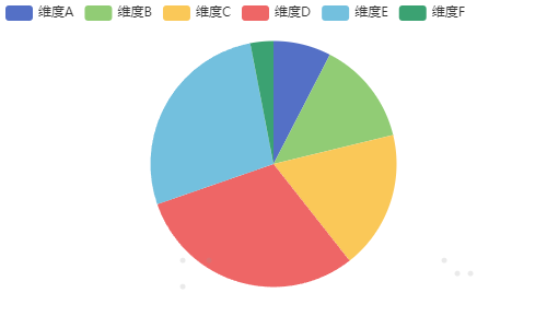
饼图是一种常见的数据可视化图表,主要用于展示各类别占总量的比例关系。通过每个扇形的大小,可以直观地看出各类别在总量中的占比。饼图适用于对比少量类别的占比数据,例如市场份额、人口结构等。
API
Props
| 参数名 | 描述 | 类型 | 默认值 |
|---|---|---|---|
| status | 默认状态,支持变量绑定 | 'default' | 'hide' | 'default' |
| showRoseType | 南丁格尔图,是否开启南丁格尔图样式 | Boolean | false |
| roseType | 模式,南丁格尔图模式 | 'radius' | 'area' | 'area' |
| inRadius | 内径,饼图内径 | string | '0%' |
| outRadius | 外径,饼图外径 | string | '75%' |
| data | 数据源,支持变量绑定 | Array<Record<string, any>> | - |
| dimensionField | 维度,类目的数据字段编码 | string | 'indicator' |
| dataField | 数值,数值系列的数据字段编码 | string | 'value' |
| width | 宽,图表画布宽度 | string | '500px' |
| height | 高,图表画布高度 | string | '300px' |
| centerLeft | 圆心左边距,圆心距离画布左侧边距 | string | '50%' |
| centerTop | 圆心上边距,圆心距离画布上侧边距 | string | '50%' |
| customChart | 配置项参数, | code | |
| 标题 | 标题,图表标题配置 | 标题 | - |
| 饼图 | 饼图,饼图配置 | 饼图 | - |
| 图例 | 图例,图表图例配置 | 图例 | - |
| 提示框 | 提示框,图表提示框配置 | 提示框 | - |
| key | 唯一标识,组件唯一标识 | string | 组件 key 值 |
Props 标题
| 参数名 | 描述 | 类型 | 默认值 |
|---|---|---|---|
| showTitle | 显示标题,图表标题是否显示 | boolean | false |
| title | 主标题,图表主标题 | string | '主标题' |
| subTitle | 副标题,图表副标题 | string | '副标题' |
| customTtile | 自定义参数(title), | code |
Props 饼图
| 参数名 | 描述 | 类型 | 默认值 |
|---|---|---|---|
| clockwise | 顺时针排布,饼图数据项排布方向 | boolean | true |
| startangle | 起始角度,排布起始角度 | string | 90 |
| percentaccuracy | 百分比数值精度,数值精度 | string | 2 |
| showLabel | 显示标签,图表是否显示标签 | boolean | false |
| labelFontSize | 字号,标签字号 | string | 12 |
| labelColor | 颜色,标签文字颜色 | string | - |
| customPie | 自定义参数(pie), | code |
Props 图例
| 参数名 | 描述 | 类型 | 默认值 |
|---|---|---|---|
| showLegend | 显示图例,图表图例是否显示 | boolean | true |
| legendPosition | 图例位置,图例显示位置 | 'auto' | 'top-left' | 'top-center' | 'top-right' | 'bottom-left' | 'bottom-center' | 'bottom-right' | 'auto' |
| legendOrient | 布局方向,图例排列方向 | 'horizontal' | 'vertical' | 'horizontal' |
| legendWidth | 宽,图例区域宽度 | string | 'auto' |
| legendHeight | 高,图例区域高度 | string | 'auto' |
| legendScroll | 支持滚动,图例超出宽高后是否支持滚动 | boolean | false |
| customLegend | 自定义参数(legend), | code |
Props 提示框
| 参数名 | 描述 | 类型 | 默认值 |
|---|---|---|---|
| showTooltip | 显示提示框,图表提示框是否显示 | boolean | true |
| tooltipTrigger | 触发类型,提示框触发类型 | 'item' | 'axis' | 'item' |
| tooltipBackgroundColor | 背景颜色,提示框背景颜色 | string | 'rgba(50,50,50,0.7)' |
| tooltipBorderColor | 边框颜色,提示框边框颜色 | string | '#333333' |
| tooltipColor | 文字颜色,提示框文字颜色 | string | '#FFFFFF' |
| tooltipFontSize | 字号,提示框文字字号 | string | 14 |
| customTooltip | 自定义参数(tooltip), | code |