 盘古低代码
盘古低代码AI 面板
介绍
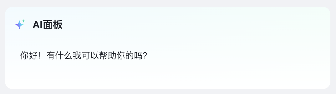
可将 AI 面板组件拖入到页面的任意位置,实现业务与 AI 智能的结合。
API
Props
| 参数 | 字段名 | 描述 | 类型 | 默认值 |
|---|---|---|---|---|
| 默认状态 | status | 组件的显隐状态控制 | default / hidden / destroy | 'default' |
| 能力配置 | appCode | 选择已配置的 AI 应用 | string | - |
| 变量 | inputs | 智能体配置时所需的变量,返回对象 | function | 返回空对象 |
| 触发模式 | mode | 用户输入input / 固定fixed | input | - |
| 输入内容 | fixedInput | 固定模式下固定的查询语句 | string | - |
| 占位文字 | placeholder | 占位文字 | string | - |
| 图标 | icon | 展开面板图标 | string | - |
| 图表颜色 | iconColor | 展开面板图标颜色 | string | - |
| 标题文字 | title | 展开面板标题 | string | AI面板 |
| 操作栏 | bubbleActions | 气泡操作栏配置 | BubbleActionItem | [] |
javascript
interface Message {
  type: "ai" | "user"; // 消息类型
  id: number;
  content: string; // 消息内容
  thougth?: string; // 思考内容
  pageJson?: any; // 页面json
  isThinking?: boolean; // 是否正在思考中
  thinkTime?: boolean; // 思考时间
  status?: "loading" | "success" | "fail"; // 消息状态
  files?: MessageFileItem[]; // 气泡中显示的文件
}


interface BubbleActionItem {
  operateType: "copy" | "refresh" | "custom"; // 操作类型,复制、重新生成、自定义,复制和重新生成为内置功能
  type: "icon" | "text"; // 按钮展示类型,图标或文本
  icon: string; // 图标 type === "icon"
  text: string; // 文本 type === "text"
  color?: string; // 按钮显示颜色
  tip?: string; // 按钮提示信息
  showCondition?: (ctx, params: { item: Message }) => boolean; // 显示条件,返回true/false
  onClick?: (ctx, params: { item: Message }) => void; // 按钮的点击事件
}