 盘古低代码
盘古低代码容器
介绍
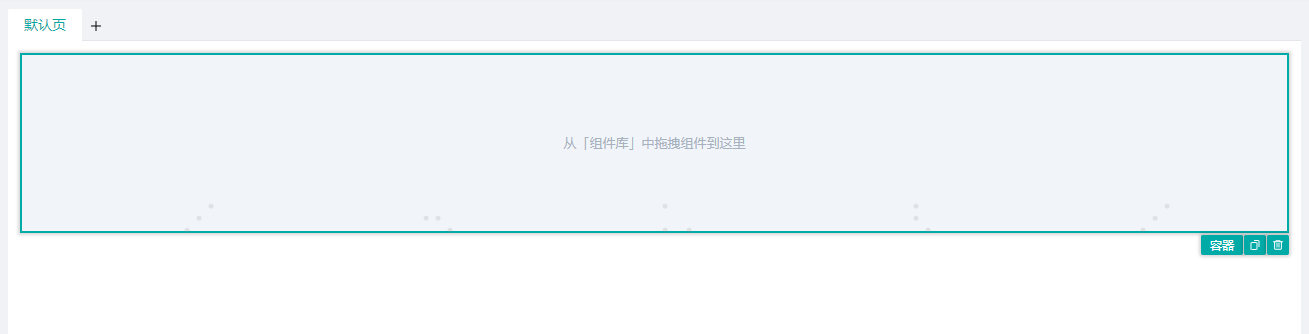
用于多个组件组合排版布局的容器组件,其内部可以拖入组件。
API
Props
| 参数名 | 描述 | 类型 | 默认值 |
|---|---|---|---|
| status | 状态, "default"|"hide"|"destroy" | string | 'default' |
| baseStyle | 自定义样式 | string | - |
| customClass | 类名绑定 | string | - |
| display | 显示,设置组件的显示布局模式 | Display | - |
| background | 背景 | Background | - |
| boxShadow | 阴影 | BoxShadow | - |
| uniqueId | 唯一标识 | string | - |
| loading | 加载状态 | boolean | false |
| data | 循环数据 | array | [] |
| paramName | 迭代变量名 | string | item |
| indexName | 索引变量名 | string | index |
| key | 循环key | string | - |
| empty | 缺省提醒 | Empty | - |
Events
| 事件名 | 描述 | 参数 |
|---|---|---|
| onClick | 点击时触发 | ctx params:MouseEvent loop:LoopParams |
| onMouseEnter | 鼠标移入时触发 | ctx params:MouseEvent loop:LoopParams |
| onMouseLeave | 鼠标移出时触发 | ctx params:MouseEvent loop:LoopParams |
| onMousedown | 鼠标移出时触发 | ctx params:MouseEvent loop:LoopParams |
| onMouseup | 鼠标移出时触发 | ctx params:MouseEvent loop:LoopParams |
Type
js
//样式-显示
type Display = {
  type:"block"|"inline-block"|"inline"|"flex",
  // type选择flex可配置以下属性
  flex:{
    flexDirection:"row"|"column"|"row-reverse"|"column-reverse",
    alignItems:"flex-start"|"center"|"flex-end"|"stretch"|"base-line",
    justifyContent:"flex-start"|"center"|"flex-end"|"space-between"|"space-around"
  }
}

//样式-背景
type Background = {
  color:string, //背景色
  size:"cover"|"contain"|"length" //填充
  // size 为length时可进行以下配置
  width:{           //宽
    unit:"px"|"%",  //单位
    value:number    //值
  }
  height:{          //高
    unit:"px"|"%",  //单位
    value:number    //值
  }
  positonY:number,  //横向偏移
  positonX:number,  //纵向偏移
}

// 样式-模糊
type BoxShadow = {
  color:string,   //颜色
  hShadow:number, //X
  vShadow:number, //Y
  blur:number,    //模糊
}

// 高级-缺省提醒
type Empty = {
  enable:boolean,    //是否开启
  icon:"null-list",  //缺省图片
  text:string,       //缺省文字
}

// 循环变量数据参数
type LoopParams = {
  indexName:string,
  paramName:string,
  ref:ComputedRefImpl, // 全部的循环变量数据
  row:number,
  rowIndex:number
}[]