 盘古低代码
盘古低代码复选框组
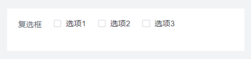
介绍
在一组可复选数据中,用户可通过复选框选择一个或多个数据。
API
Props
| 参数名 | 描述 | 类型 | 默认值 |
|---|---|---|---|
| status | 状态 | 'default' |'disabled'| 'hide'|'readonly' | 'default' |
| title | 标题 | string | '复选框' |
| showLabel | 显示标题 | boolean | true |
| width | 字段占比 | '25%'|'50%'|'75%'|'100%' | '100%' |
| labelWidth | 标签宽度 | string | - |
| value | 默认值 | string | - |
| name | 数据字段 | string | - |
| limit | 最大选择数量 | number | - |
| direction | 排列方式 | 'horizontal'|'vertical' | 'horizontal' |
| isColor | 彩色, 选项及选择结果以不同颜色呈现 | boolean | false |
| options | 选项配置 | Options | - |
| baseStyle | 自定义样式 | string | - |
| customClass | 类名绑定 , 绑定类的名称 | string | - |
| boxStyle | 盒模型 , margin,border,padding设置 | BoxStyle | - |
| uniqueKey | 唯一标识 , 组件的唯一标识 | string | - |
| customRender | 自定义复选框内容 | boolean | false |
| renderFunc | 自定义复选框内容渲染函数 | Function | 'function render(ctx, params) {\n // 返回jsx渲染内容\n return {params.item.value}\n}' |
| extra | 补充说明 | string | - |
| tip | 气泡提醒 | string | - |
| validate | 校验 | Validate | - |
| loop | 循环, 循环渲染设置 | Loop | - |
Props-选项配置
| 参数名 | 描述 | 类型 | 默认值 |
|---|---|---|---|
| key | 选项值 | string | - |
| value | 标题 | string | - |
| color | 颜色 | 'default'|'cyan'|'red'| 'green'|'lime'| 'orange'|'orangered'|'gold'|'purple'| 'magenta'|'blue'|'gray'|'pinkpurple' | - |
| default | 默认选中 | boolean | false |
| disabled | 禁用 | boolean | - |
Events
| 事件名 | 描述 | 参数 |
|---|---|---|
| onChange | 值发生改变时 | ctx params: {value: string[],checked:boolean,checkedKey:string} loop:LoopParams |
Type
javascript
// 选项配置
type Options = {
  "key":string,
  "value":string,
  "default":boolean,
  "color":"default"\|"cyan"\|"red"\|"green"\|"lime"\|"orange"\|"orangered"\|"gold"\|"purple"\|"magenta"\|"blue"\|"gray"\|"pinkpurple",
  "disabled":boolean
}