 盘古低代码
盘古低代码下拉菜单
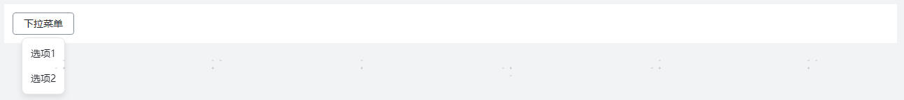
介绍
页面上的命令过多时,可将备选命令收纳到向下展开的浮层容器中。
API
Props
| 参数名 | 描述 | 类型 | 默认值 |
|---|---|---|---|
| status | 默认状态 | 'default' | 'disabled' | 'hide' | 'default' |
| triggerType | 触发器类型 | 'button' | 'icon' | 'button' |
| title | 标题 | string | I18nEntry | '下拉菜单' |
| icon | 图标选择 | string | - |
| position | 位置 | 'top' | 'tl' | 'tr' | 'bottom' | 'bl' | 'br' | 'bottom' |
| trigger | 触发方式 | 'hover' | 'click' | 'focus' | 'contextMenu' | 'click' |
| groupType | 分组方式 | 'group' | 'dsubmenu' | 'group' |
| baseStyle | 自定义样式 | string | - |
| customClass | 类名绑定 | string | - |
| btnType | 类型 | 'primary' | 'secondary' | 'text' | 'secondary' |
| size | 尺寸 | 'large' | 'medium' | 'small' | 'mini' | 'medium' |
| shape | 按钮形状 | 'square' | 'round' | 'square' |
| maxHeight | 下拉菜单最大高度。单位:px | number | 200 |
| uniqueKey | 唯一标识, 组件的唯一标识 | string | - |
| showRightArrow | 显示右侧箭头 | boolean | false |
| showBtn | 开启独立按钮 | boolean | false |
| loop | 循环数据, 循环渲染设置 | Loop | - |
Props 选项
| 参数名 | 描述 | 类型 | 默认值 |
|---|---|---|---|
| status | 默认状态 | 'default' | 'disabled' | 'hide' | 'default' |
| title | 标题 | string | I18nEntry | - |
| color | 颜色 | string | - |
| groupTitle | 分组标题 | string | I18nEntry | - |
| authControl | 权限控制 | boolean | false |
| authDesc | 权限项描述 | string | - |
Events
| 事件名 | 描述 | 参数 |
|---|---|---|
| onSelect | 选择时触发 | ctx:PangeaContext params:{ ev: PointerEvent, option: { index: number, value: string } } loop:LoopParams |
| onClick | 点击独立按钮时触发 | ctx:PangeaContext params:PointerEvent loop:LoopParams |
Events 选项
| 事件名 | 描述 | 参数 |
|---|---|---|
| onSelect | 选择时触发 | ctx:PangeaContext params:{ value: string } loop:LoopParams |
Type
javascript
// 循环
type Loop = {
  data: any[],
  paramName: string,
  indexName: string,
  key: string,
};

// 循环变量数据参数
type LoopParams = {
  indexName: string,
  paramName: string,
  ref: ComputedRefImpl, // 全部的循环变量数据
  row: any,
  rowIndex: number,
}[];

// 国际化词条
type I18nEntry = {
  val: string,
  intlKey: string,
};