 盘古低代码
盘古低代码表单容器
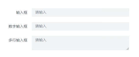
介绍
表单内容区域,内部可拖入表单组件。
API
Props
| 参数名 | 描述 | 类型 | 默认值 |
|---|---|---|---|
| status | 默认状态 | 'default' | 'hide' | 'default' |
| backgroundColor | 背景色 | 'white' | 'transparent' | 'transparent' |
| layout | 布局方式 | 'horizontal' | 'vertical' | 'inline' | 'horizontal' |
| size | 控件大小 | 'large'|'medium'|'small'|'mini' | 'medium' |
| labelWidth | 标签宽度 | string | - |
| labelAlign | 标签对齐 | 'left'|'right' | 'right' |
| readonlyEmptyText | 只读状态无数据时默认文案 | '无'|'--' | '无' |
| baseStyle | 自定义样式 | string | - |
| customClass | 类名绑定 | string | - |
| width | 宽 , 布局容器宽度 | string | - |
| height | 高 , 布局容器高度 | string | - |
| opacity | 不透明度 , 布局容器背景色透明度 | string | - |
| display | 显示, 设置组件的显示布局模式 | Display | - |
| boxStyle | 盒模型, margin,border,padding设置 | BoxStyle | - |
| borderRadius | 圆角 | BorderRadius | - |
| boxShadow | 阴影 | BoxShadow | - |
| uniqueKey | 唯一标识, 组件的唯一标识 | string | - |
| scrollToFirstError | 验证失败后滚动到第一个错误字段 | boolean | false |
| loop | 循环数据, 循环渲染设置 | Loop | - |
Events
| 事件名 | 描述 | 参数 |
|---|---|---|
| onMounted | 挂载完成后执行 | ctx params:PangeaContext loop:LoopParams |
| onUnMounted | 实例被卸载之后调用 | ctx params:PangeaContext loop:LoopParams |
Type
javascript
//显示
type Display = {
  type:"block"|"inline-block"|"inline"|"flex",
  // type选择flex可配置以下属性
  flex:{
    flexDirection:"row"|"column"|"row-reverse"|"column-reverse",
    alignItems:"flex-start"|"center"|"flex-end"|"stretch"|"base-line",
    justifyContent:"flex-start"|"center"|"flex-end"|"space-between"|"space-around"
  }
}

// 盒模型
type BoxStyle = {
  "marigin": [string|string|string|string],
  "border": [string|string|string|string],
  "padding": [string|string|string|string],
  "borderColor": 'color-border-1'|'color-border-2'|'color-border-3'|'color-border-4',
  "borderStyle": 'solid'|'dotted'|'dashed'
}

// 阴影
type BoxShadow = {
  "color":string,
  "hShadow":string,
  "vShadow":string,
  "blur":number,
}

// 圆角
type BorderRadius = {
  "topLeft":number,
  "topRight":number,
  "bottomLeft":number,
  "bottomRight":number,
}

// 循环
type Loop = {
  "data": any[],
  "paramName": string,
  "indexName": string,
  "key": string
}

// 循环变量数据参数
type LoopParams = {
  "indexName":string,
  "paramName":string,
  "ref":ComputedRefImpl, // 全部的循环变量数据
  "row":number,
  "rowIndex":number
}[]